
The Impossible Math of the Federal Reserve
September 21, 2017Yesterday the Federal Reserve officially signaled the beginning of its balance sheet run-off. At this point, that’s old news. But, today the Fed released the Z.1 Flow of Funds, which adds to the intrigue of the balance sheet run-off. Why?
Instead of getting wrapped up in fancy terms like quantitative easing and large-scale asset purchases, I find it easier to think about extraordinary monetary policy from a savings standpoint. Distilled to its roots, the Fed has been manufacturing “savings” from thin air for the better part of a decade. When the financial crisis hit in 2008, American savings were depleted, so the Fed had to step in to produce savings (to finance huge government deficits). Now the Fed is attempting to remove that “savings” at a time when:
- The private sector is experiencing falling savings.
- The government is likely on the precipice of expanding its dis-saving in the form of greater deficits.
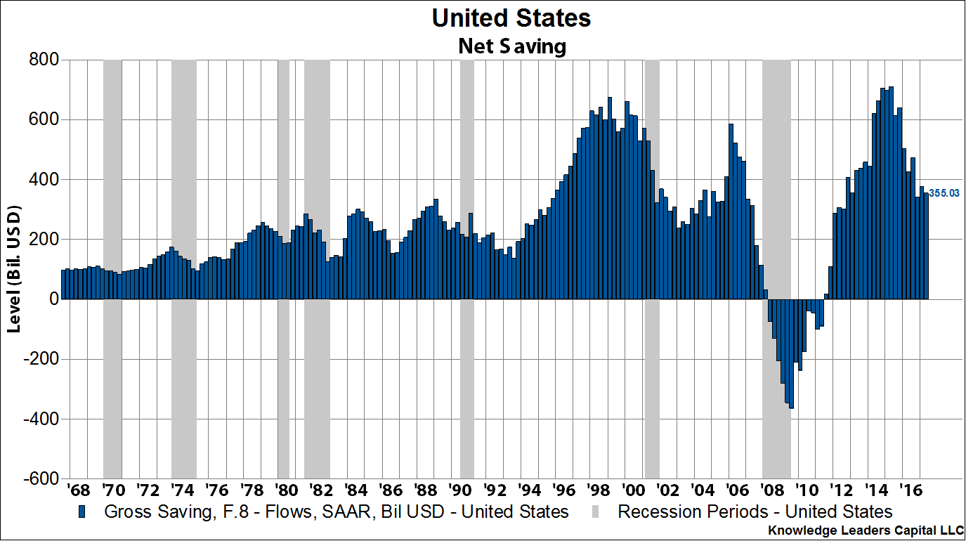
Some data and charts will help explain the concept. In the Flow of Funds, released quarterly by the Fed, the relevant section to this discussion (out the 198 page report) is F.4 – Savings and Investment by Sector. Below is a clip from that table, highlighting aggregate net savings by sector.

A couple quick notes about the above data:
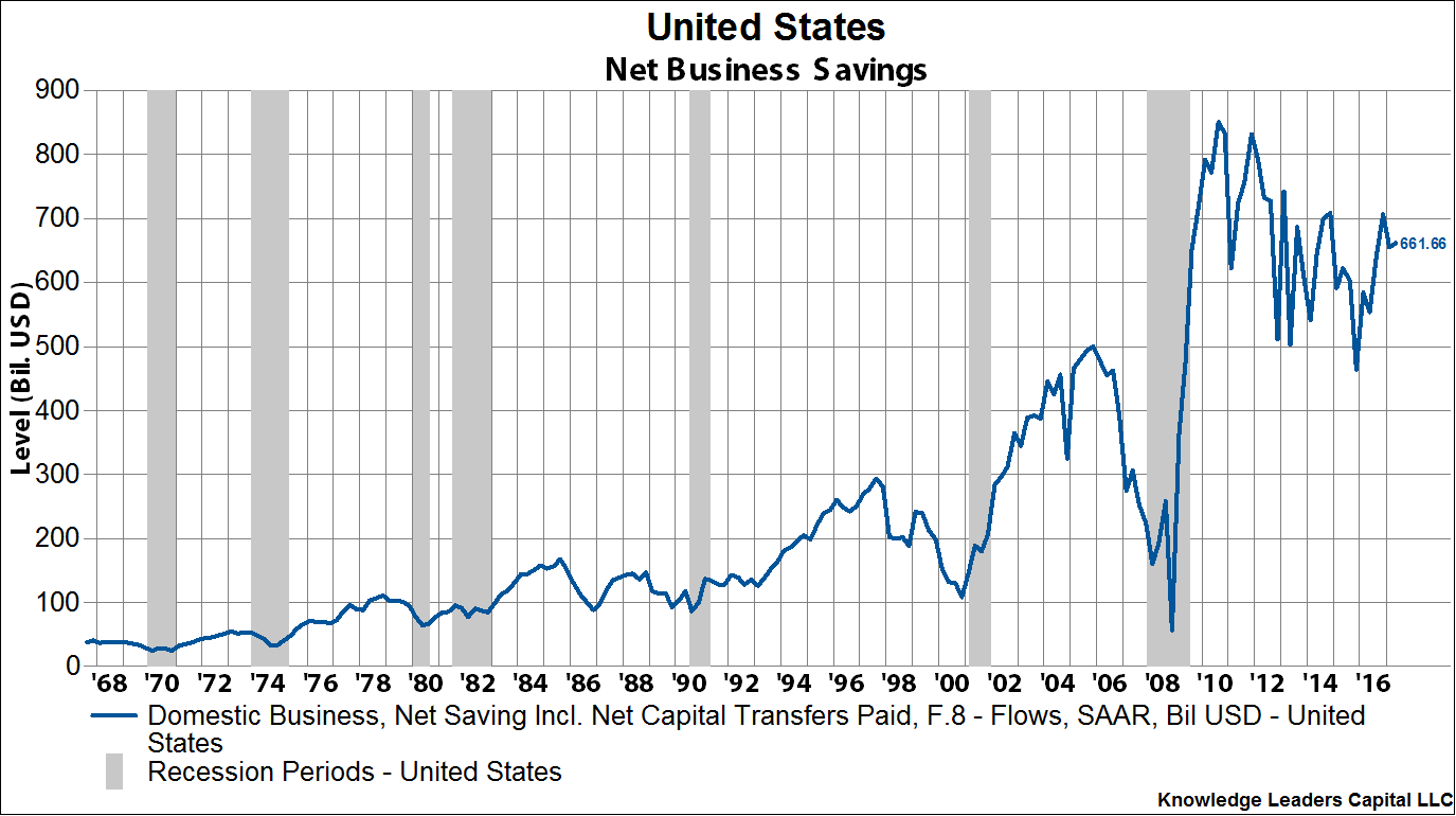
- Net savings of domestic business is basically undistributed earnings.
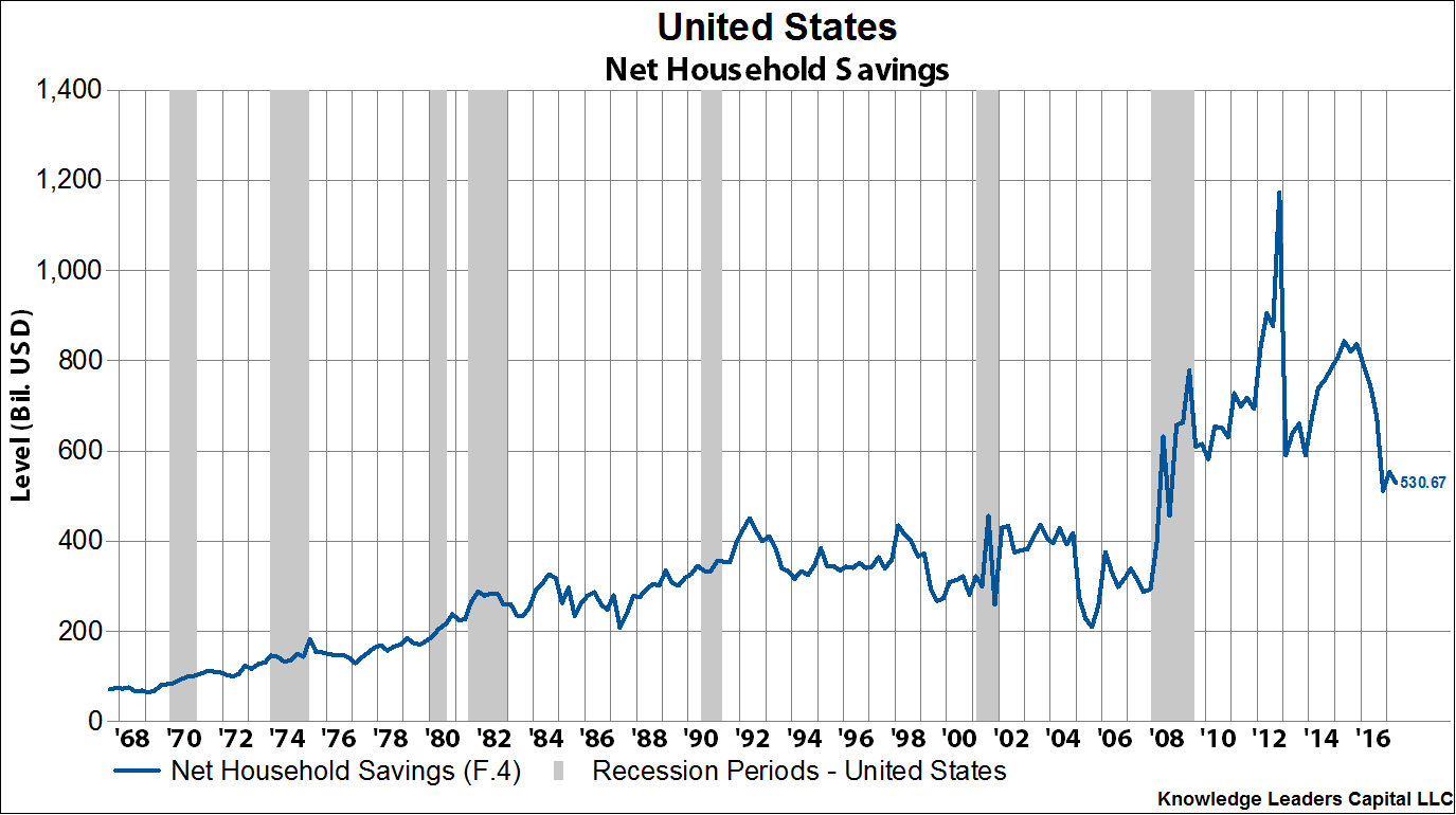
- Net household savings is a residual of income minus consumption.
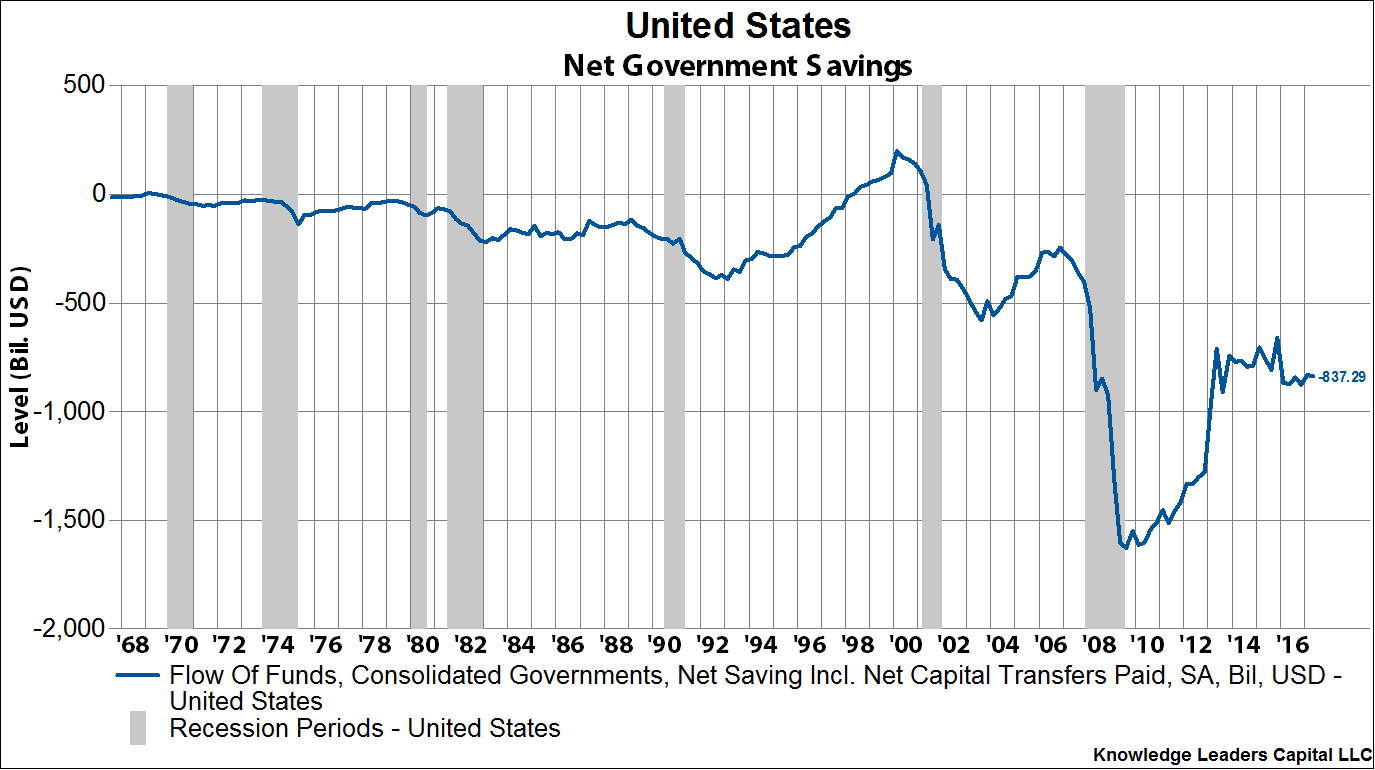
- Net government saving (or dis-saving as is the case) is the aggregate deficits of federal, state and local governments.
These net savings are the aggregation of what is left after businesses replace worn out capital and pay dividends, what households have after paying their bills and what the government has after paying its bills. It is the country’s seed corn. If there is no net savings, there can be no net investment.
The financial crisis of 2008 decimated the stock of savings, and it actually dipped negative for the first time ever. Current aggregate net savings in the US are $355 billion. That’s it!
Decomposing net savings into its sectoral components, we’ll start with the household sector. After the financial crisis, American households ramped up their savings, but since peaking at the end of 2012, household savings are plummeting.
Next, we can turn to the corporate sector. After the financial crisis, corporate profits surged, and undistributed corporate profits peaked in the third quarter of 2010 at just over $800 billion. But since then, corporate net savings have been fading.
Last, we have the government. After the tech wreck of 2000, government dis-saving picked up pace, but after the financial crisis the rate of dis-saving exploded.
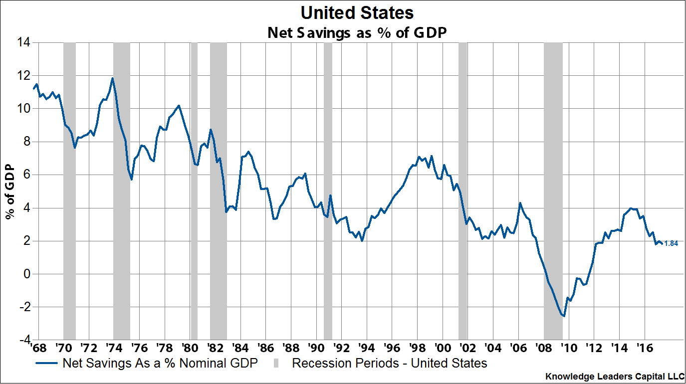
So, when we combine the net savings of all the sectors and compare it to GDP, we get the following chart highlighting the long-term structural decline in American net savings.
If the Fed starts shedding assets at $10 billion/month, ramping to $50 billion/month by 2019, can the private sector absorb these securities at the same the government budget deficit is set to widen by perhaps $100-$150 billion in the next couple years?
Not to state the obvious, but all else equal, if the Fed started shedding assets at $30 billion a month (or $360 billion a year), it would exhaust the entire stock of private savings. This doesn’t allow for larger government deficits. Given the current savings level, it is mathematically impossible for the Fed to shed assets at $50 billion/month. By 2019, as we are farther out from peak net savings rates set in 2015, it is likely the stock of private savings is smaller still, and hence the ability for the Fed to shed assets at a rate of $50 billion/month is utterly impossible. Net savings have fallen in the last 2 years from a peak of just over $700 billion to the current $355 billion. Will savings halve again in the next two years? If so, there is no mathematical way in the world the Fed can shed assets at the rate it outlined yesterday.
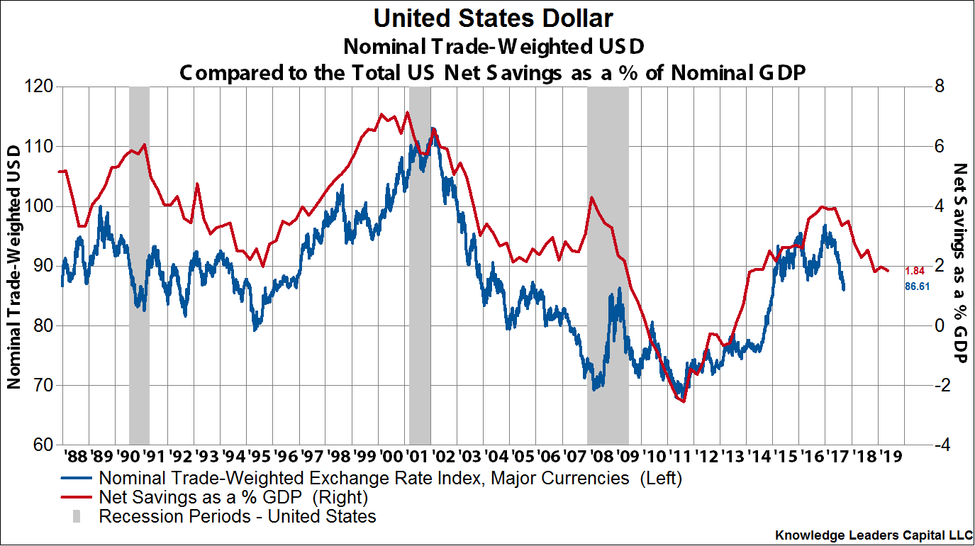
While we are on the topic of aggregate net national savings, I thought it would be instructive to remind readers of our analysis on the relationship between net national savings and asset prices.
First, the cycle of net savings as a percent of GDP is a great way to measure movements in the US Dollar. As can be seen in the chart below, with about a two-year lead, the US Dollar follows the movement of net national savings. The drop YTD in the US Dollar, and our hypothesis that we have entered a US Dollar bear market, square with this analysis. Suffice it to say, I think the opinion that Fed rate increases is US Dollar bullish is just plain wrong.
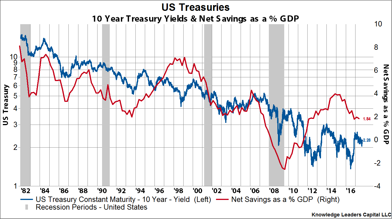
For US Treasury bonds, history suggests that a decline in the savings rate is associated with lower interest rates. Bond bear markets like 1987, 1994 or 2010 occur when the savings rate is rising. The foundation for a bond bear market does not appear in place.
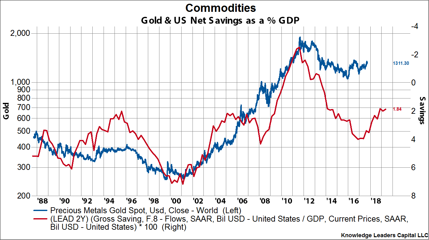
For gold, history suggests that a falling savings rate is associated with higher gold prices. Here again, with about a two-year lag, gold prices are highly correlated with national savings. The foundation for a bull market in gold appears to be in place.
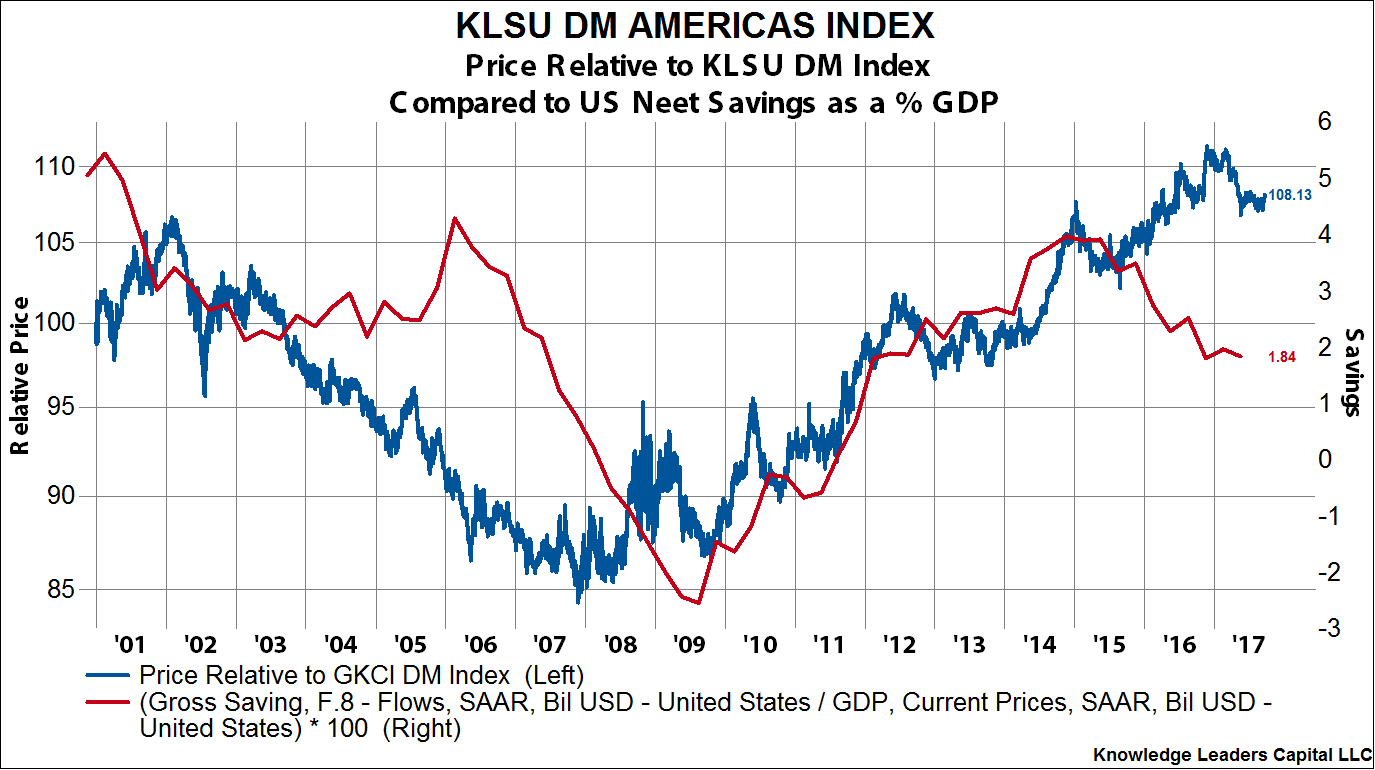
Lastly, I’ll look at stocks. In the charts below I use our KLSU indexes which are market-cap weighted indexes that capture the top 85% of a region’s market cap. Unfortunately, our history is a little shorter here as our indexes only go back to 2000. But, I think the trend is still pretty clear. Below I plot the performance of KLSU North America relative to KLSU Developed Markets. This is not an encouraging-looking chart for US equities.
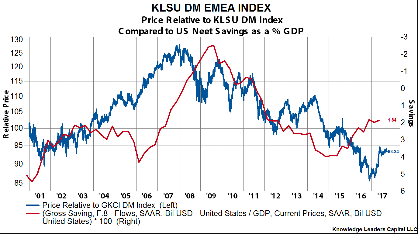
For other developed regions, the turn in the US savings cycle is positively associated with their outperformance. For visual clarity, I inverted the net savings line (right axis). The two-year old deterioration in US net savings makes Europe’s outperformance YTD more logical.
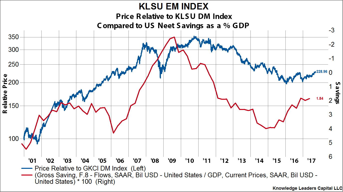
For emerging markets, the turn down in US net savings is also broadly positive. Here again, the net savings series is inverted for visual clarity.